

Our "What's Your Dream" slogan goes beyond a typical tagline; it embodies our commitment to genuinely understanding each client’s unique aspirations. We don’t just focus on real estate transactions — we delve into your goals, passions, and desires to help bring your broader vision to life. By listening carefully and engaging deeply, we tailor our approach to align with what matters most to you, ensuring that every step we take supports not only a home purchase or sale but also your overall life ambitions. This personalized connection empowers us to transform dreams into reality, making your experience with us truly meaningful and fulfilling.
What’s your Dream?
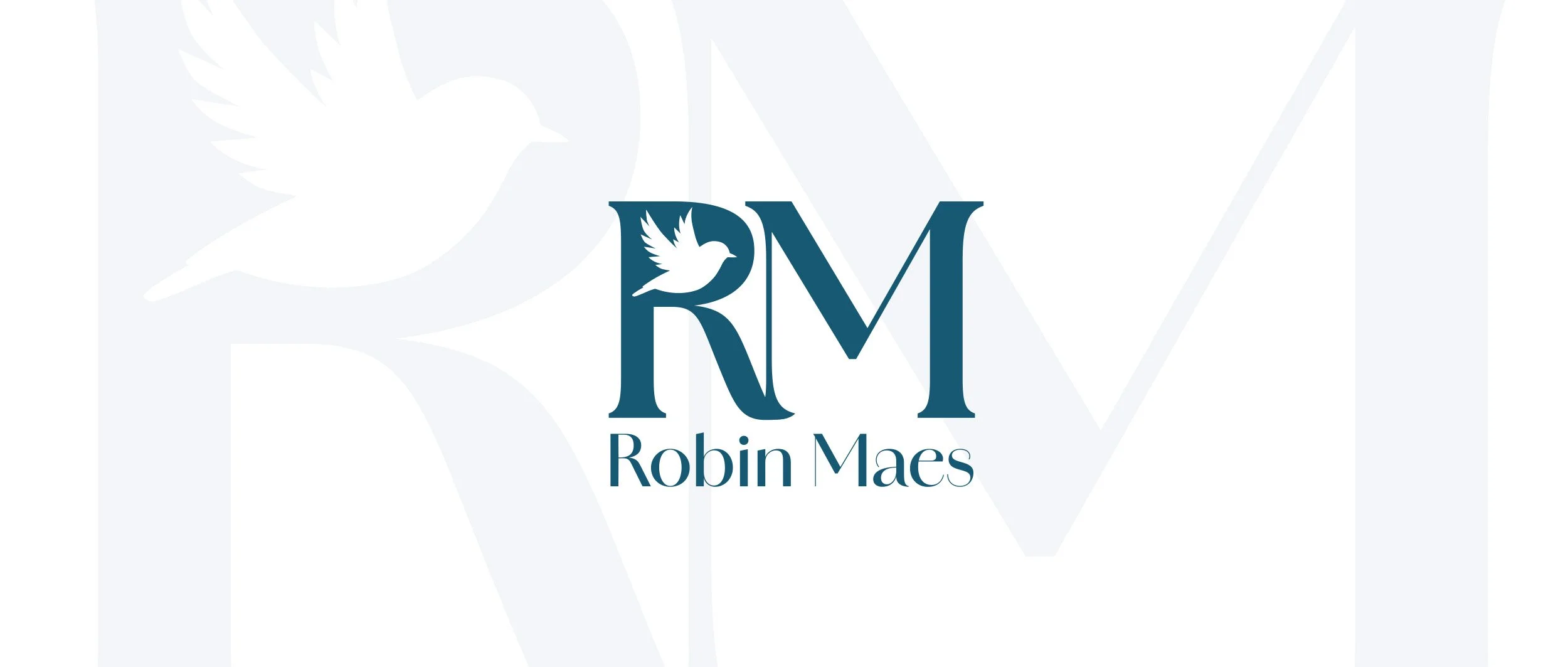
Primary Logo
Our RM monogram logo is the foundation of our brand, embodying more than just Robin’s initials. It symbolizes stability, trust, and professionalism, reflecting the qualities of a sturdy and strong home. The design conveys a sense of reliability and strength, assuring clients and partners alike of our solid foundation.
Complementing this, the bird element introduces a touch of calm, beauty, and grace. This carefully crafted balance between strength and elegance ensures that our brand not only stands firm but also inspires confidence and warmth. Together, the RM monogram and the bird create a harmonious visual narrative that perfectly represents the essence of who we are and what we offer.
Secondary Logo
Our bird logo beautifully captures Robin’s essence, embodying her vibrant spirit and dynamic nature. The design showcases a robin in mid-flight, symbolizing her constant movement and eagerness to explore the Bay Area. This imagery reflects her approach to real estate—not just as a transaction but as an opportunity to connect deeply with the community. As the robin waves its wings, it represents Robin’s energy in reaching out to people, forging friendships, and building meaningful relationships that go beyond mere business.
More than just a symbol of flight, the logo embodies Robin’s mission to bring joy, love, and positivity wherever she goes. Flying over the Bay Area, Robin spreads warmth and encouragement, helping clients fulfill their dreams of finding the perfect home. It highlights her dedication to uplifting others and fostering connections, illustrating that her role extends beyond selling homes to making a genuine, heartfelt impact in people’s lives. The bird in motion reminds us that Robin is always present, active, and ready to support her community, bringing light and hope in every interaction.

Color Palette
Our primary blue color was carefully chosen to embody the essence of the Bay Area’s unique environment. Drawing inspiration from the region’s expansive bodies of water—ranging from the sparkling San Francisco Bay to the vast Pacific Ocean—the blue reflects the calming and refreshing qualities of these natural elements. Additionally, the color captures the area’s famously beautiful weather, with clear skies and gentle breezes that inspire a sense of openness and tranquility. This connection to the local landscape grounds our brand in the community, creating an immediate visual link to the place our clients call home.
Beyond geography, the blue also mirrors Robin’s personality and character, who is known for putting clients at ease through a warm, approachable demeanor. The shade was chosen for its ability to convey trust, calmness, and positivity—qualities that Robin naturally embodies and that we want every client to feel when interacting with our brand. This color enables us to spread a sense of joy and optimism, fostering an environment where clients feel supported and confident. In this way, our primary blue stands as a symbol of both the Bay Area’s beauty and the welcoming spirit that defines our approach.
